Keeping Up With The Joneses.
As Creative Director at RARE Design, I had the opportunity to lead the development of a newly updated visual brand identity and comprehensive brand guidelines for Jones Capital, a growing investment company rooted in Hattiesburg, Mississippi. Jones Capital carries a story that balances legacy with forward momentum. The brand needed to reflect not only its entrepreneurial spirit but also its role as a trusted partner in building and sustaining companies across multiple industries.
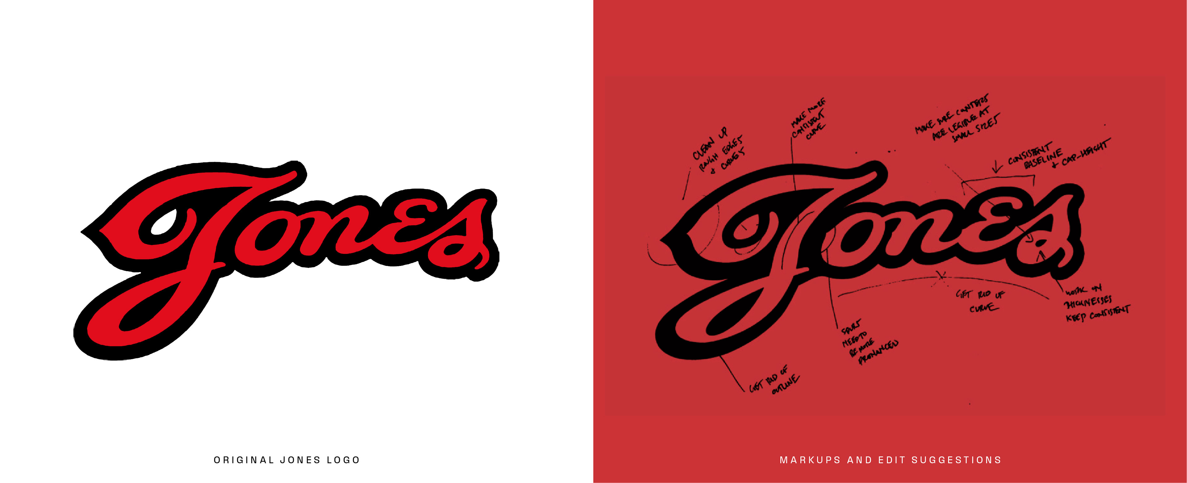
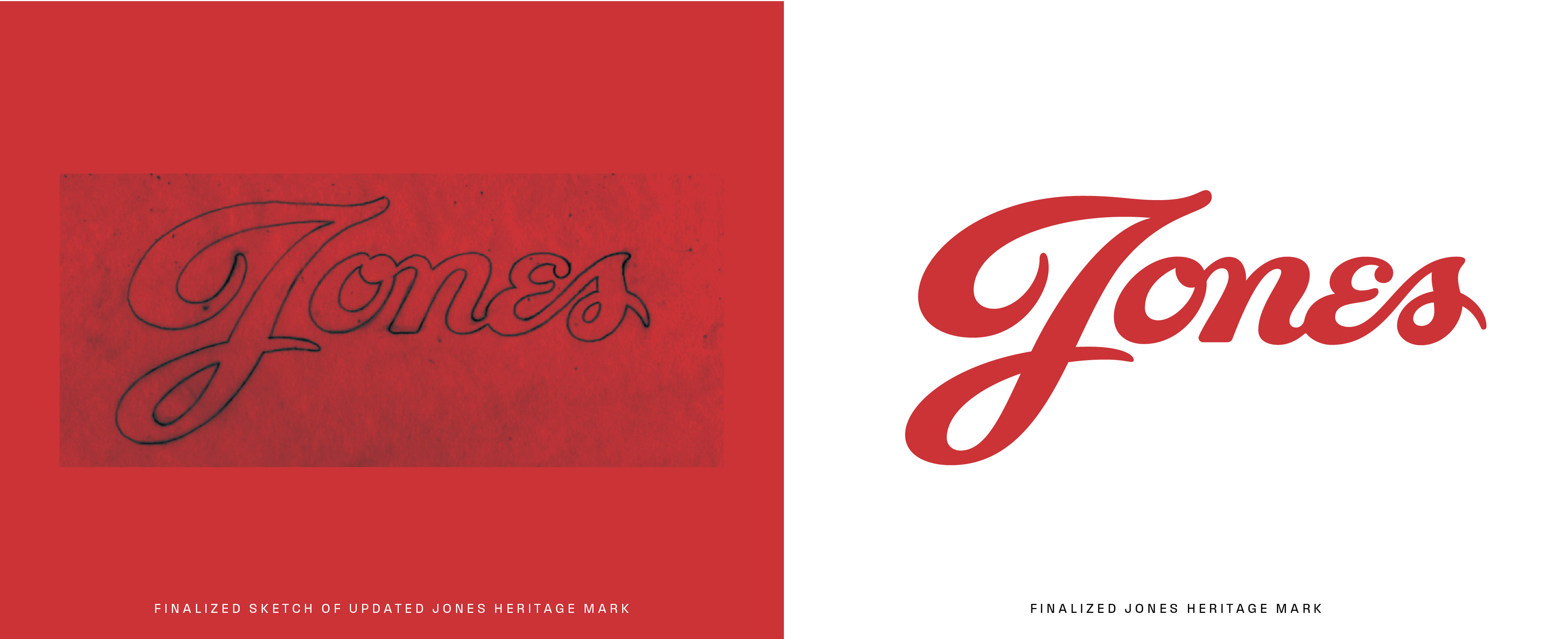
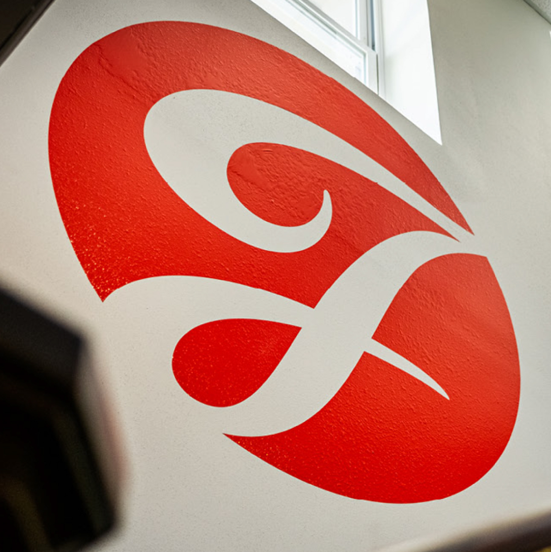
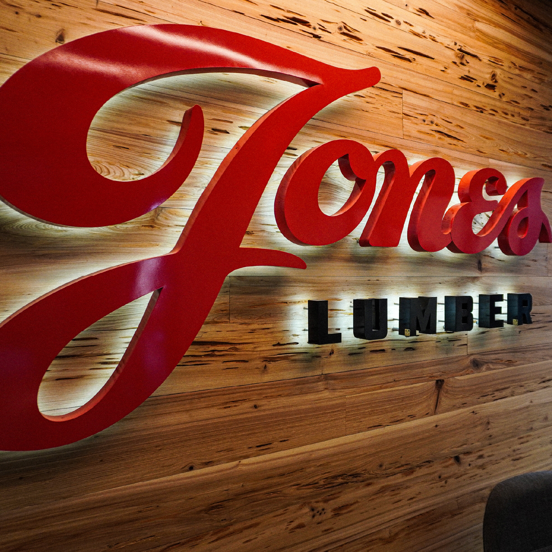
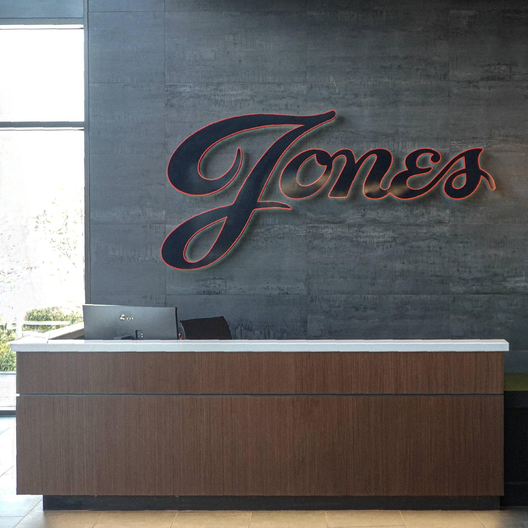
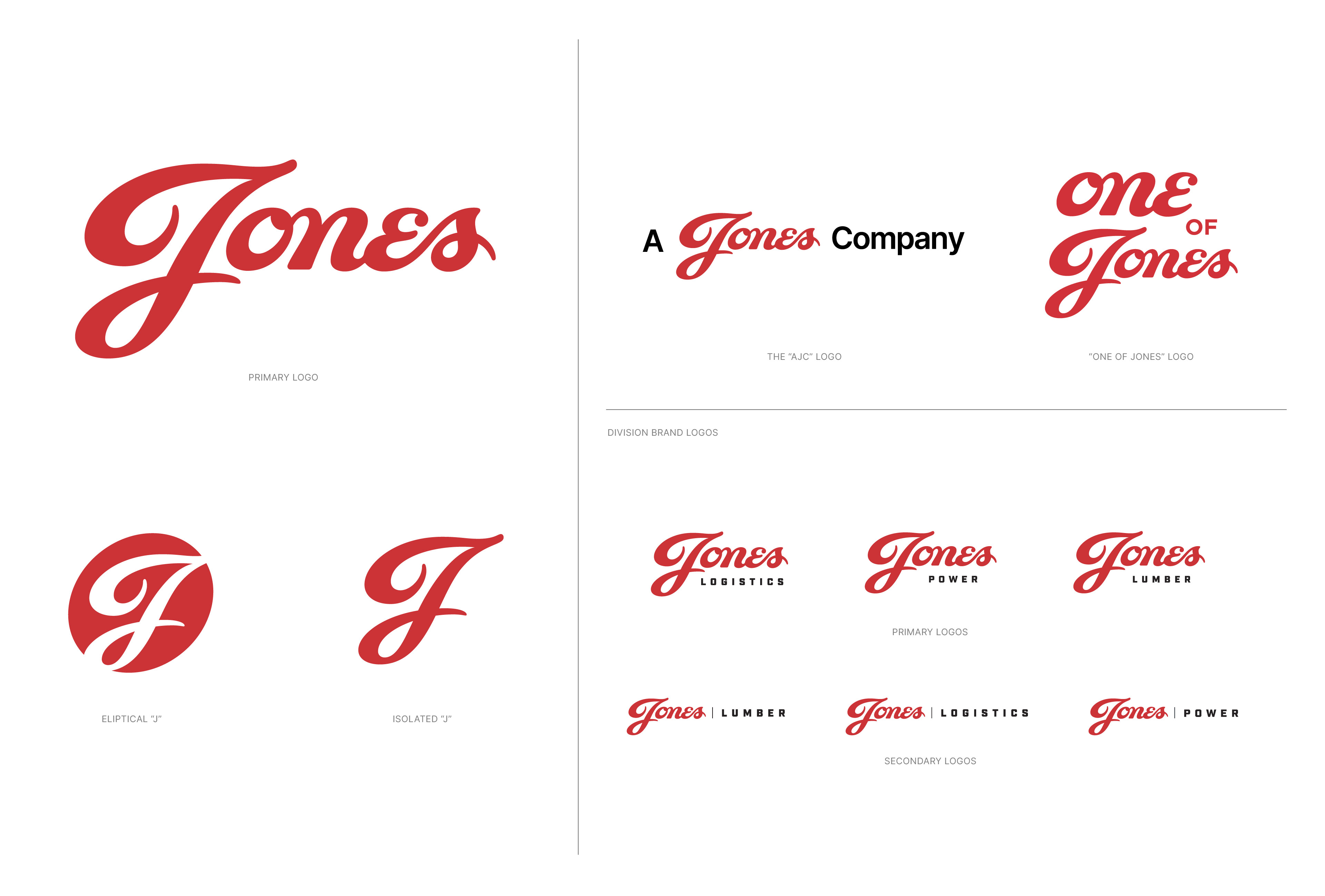
The visual identity system was built around a refined primary mark that communicates strength, stability, and clarity. Supporting elements, including a considered typographic system, secondary iconography, and a versatile color palette, were crafted to give the brand both authority and warmth. The updated identity leaned into Jones Capital’s role as a community-driven organization while positioning it with the confidence of a national investment firm.
To ensure lasting consistency, I developed a comprehensive set of brand guidelines. These guidelines detailed everything from philosophy and brand voice to exact visual standards for print, digital, and environmental applications. The goal was to provide the Jones Capital team with a system that could scale across platforms and empower them to tell their story cohesively as they continue to grow.
The RARE Design Team:
Ethan Manning - Creative Director / Principal Designer
Ben Jones - Account Director
Harry Richardson - Designer
Sydney Beech - Designer
Ben Jones - Account Director
Harry Richardson - Designer
Sydney Beech - Designer
Services Provided:
Identity Design
Brand Unification
Philosophical Brand Alignment
Brand Guidelines
Brand Unification
Philosophical Brand Alignment
Brand Guidelines
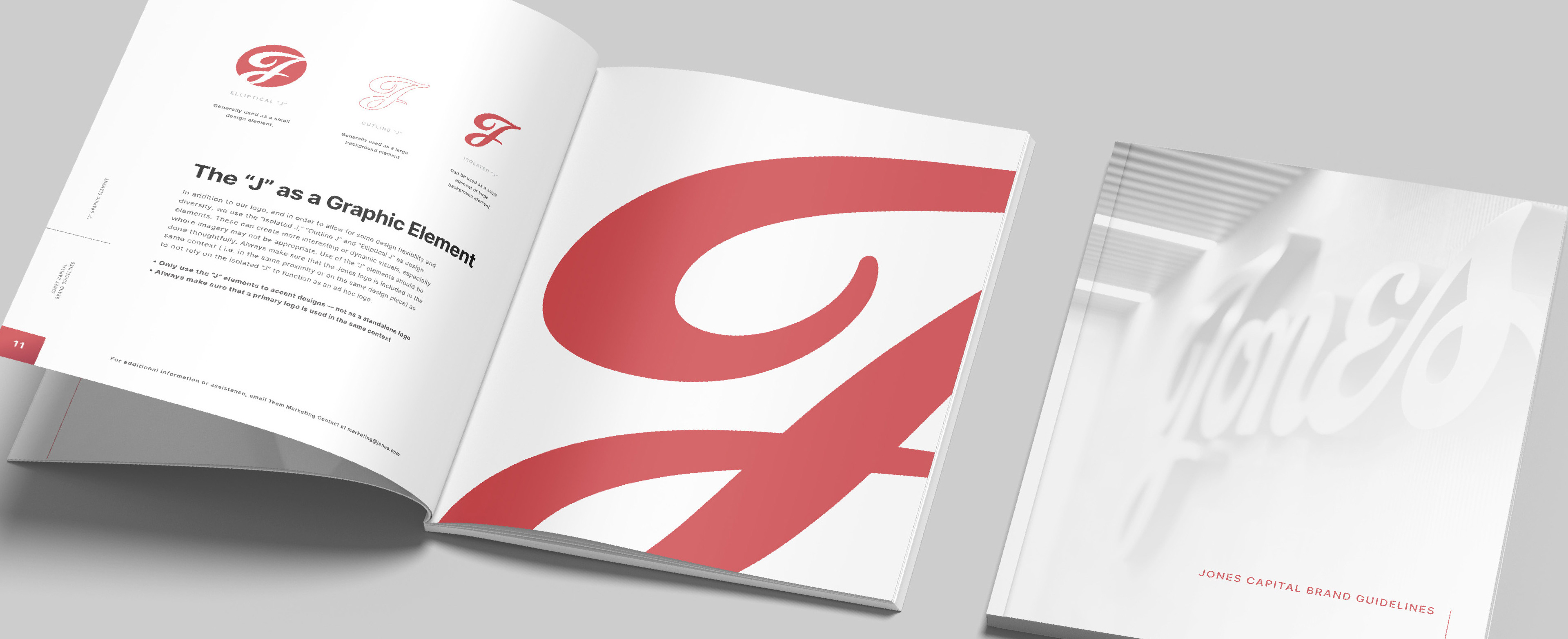
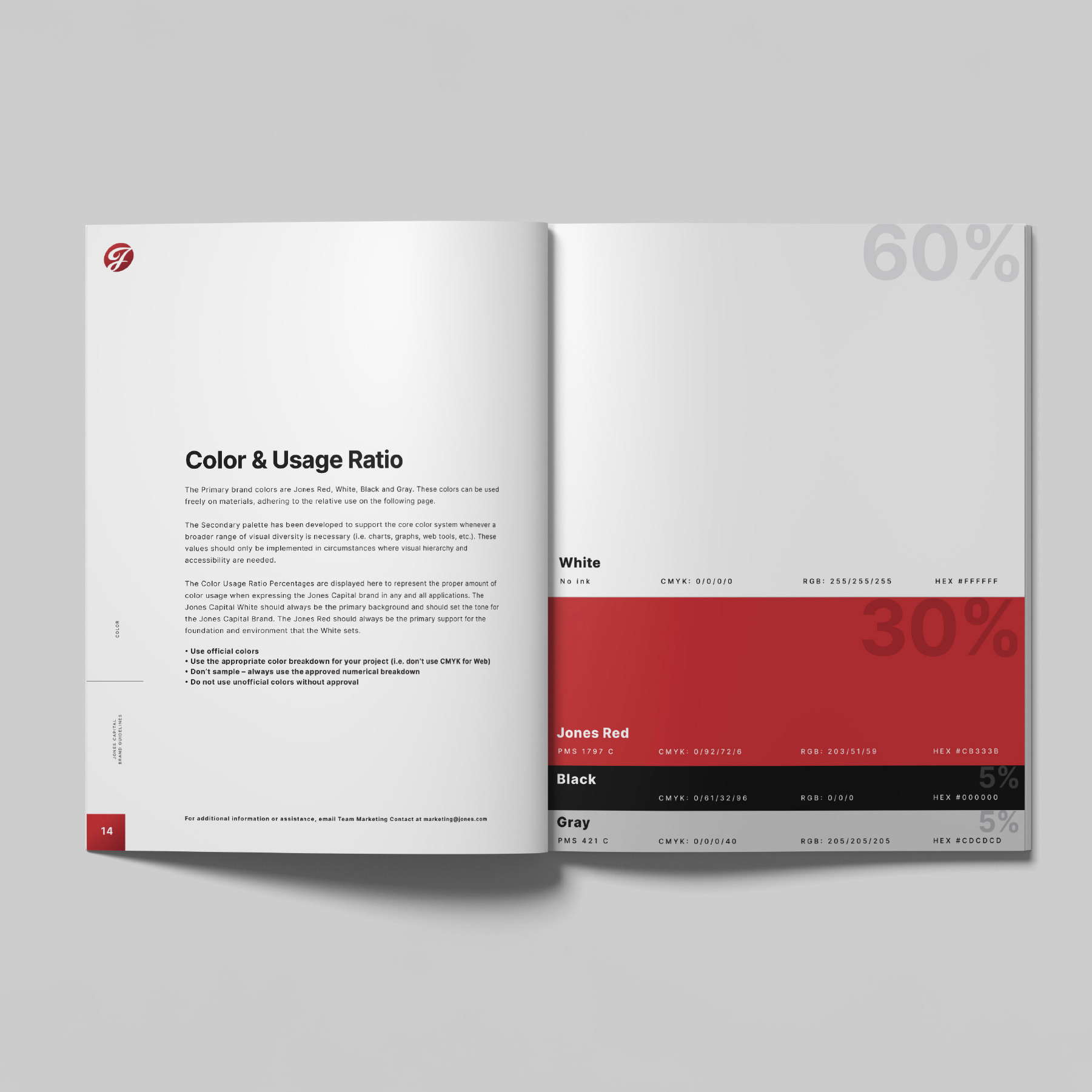
JONES CAPITAL | UPDATED HERITAGE MARK PROCESS
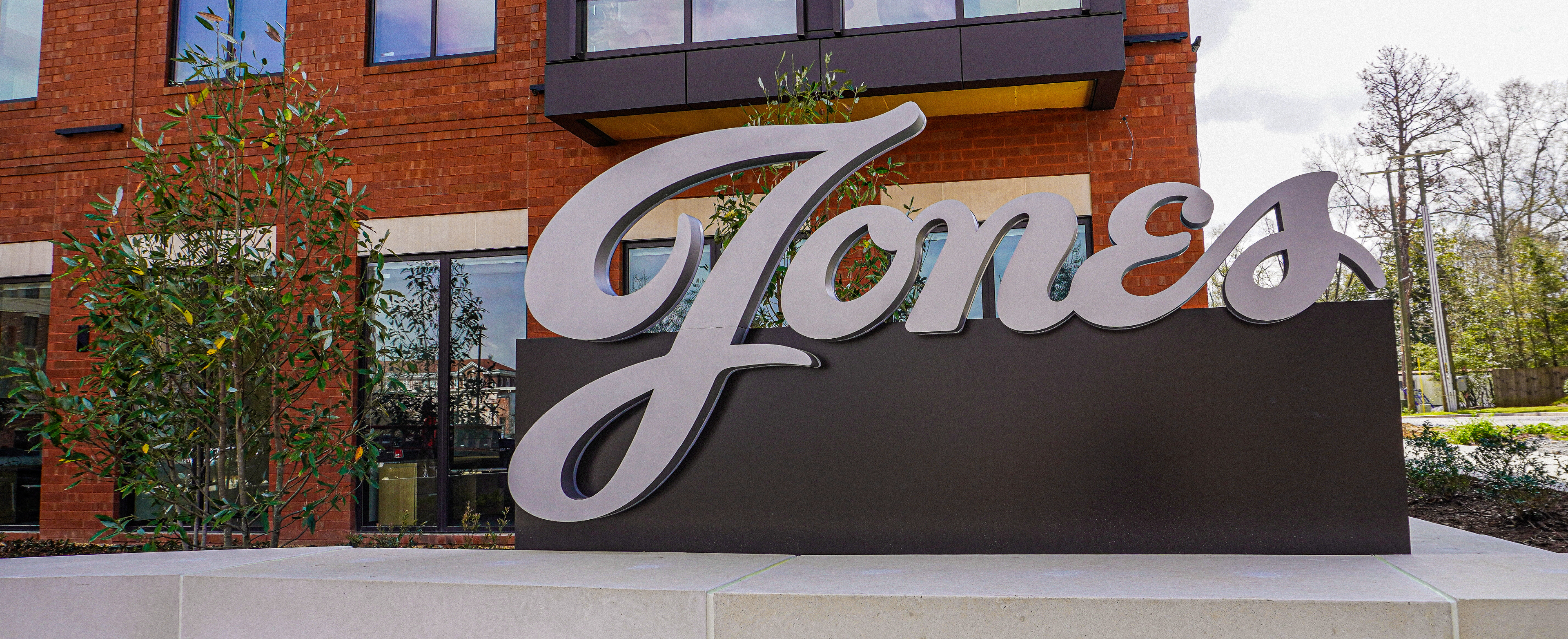
JONES CAPITAL | HERITAGE MARK & IDENTITY SYSTEM ACTIVATION
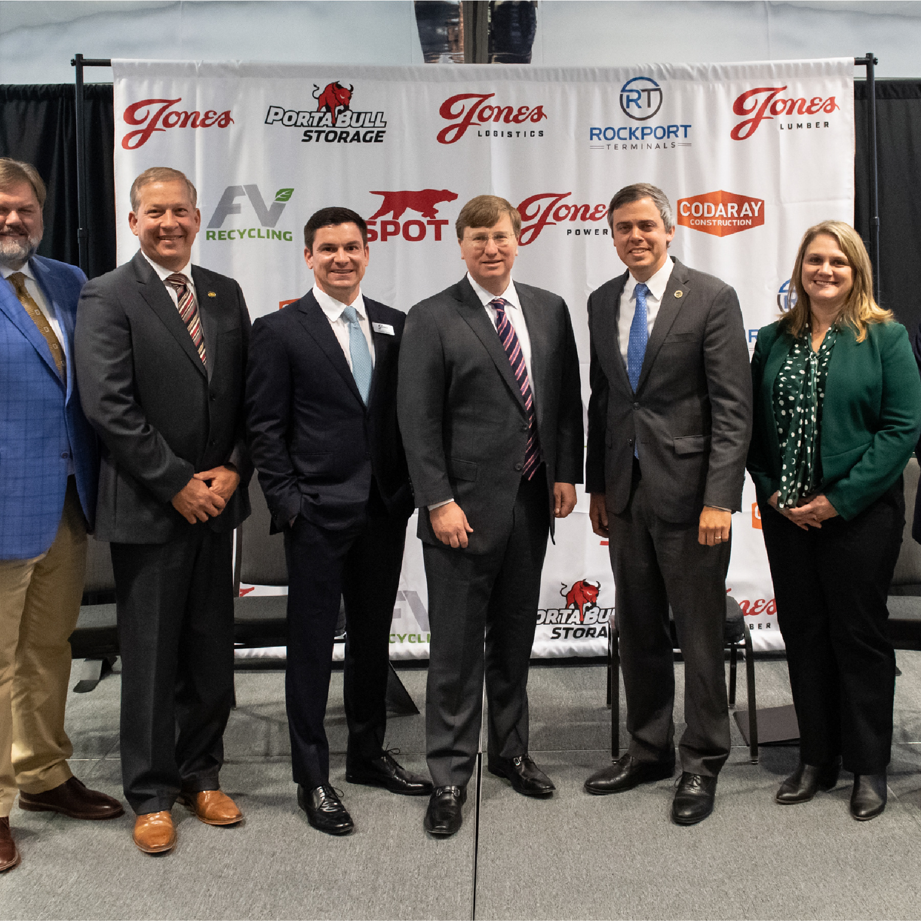


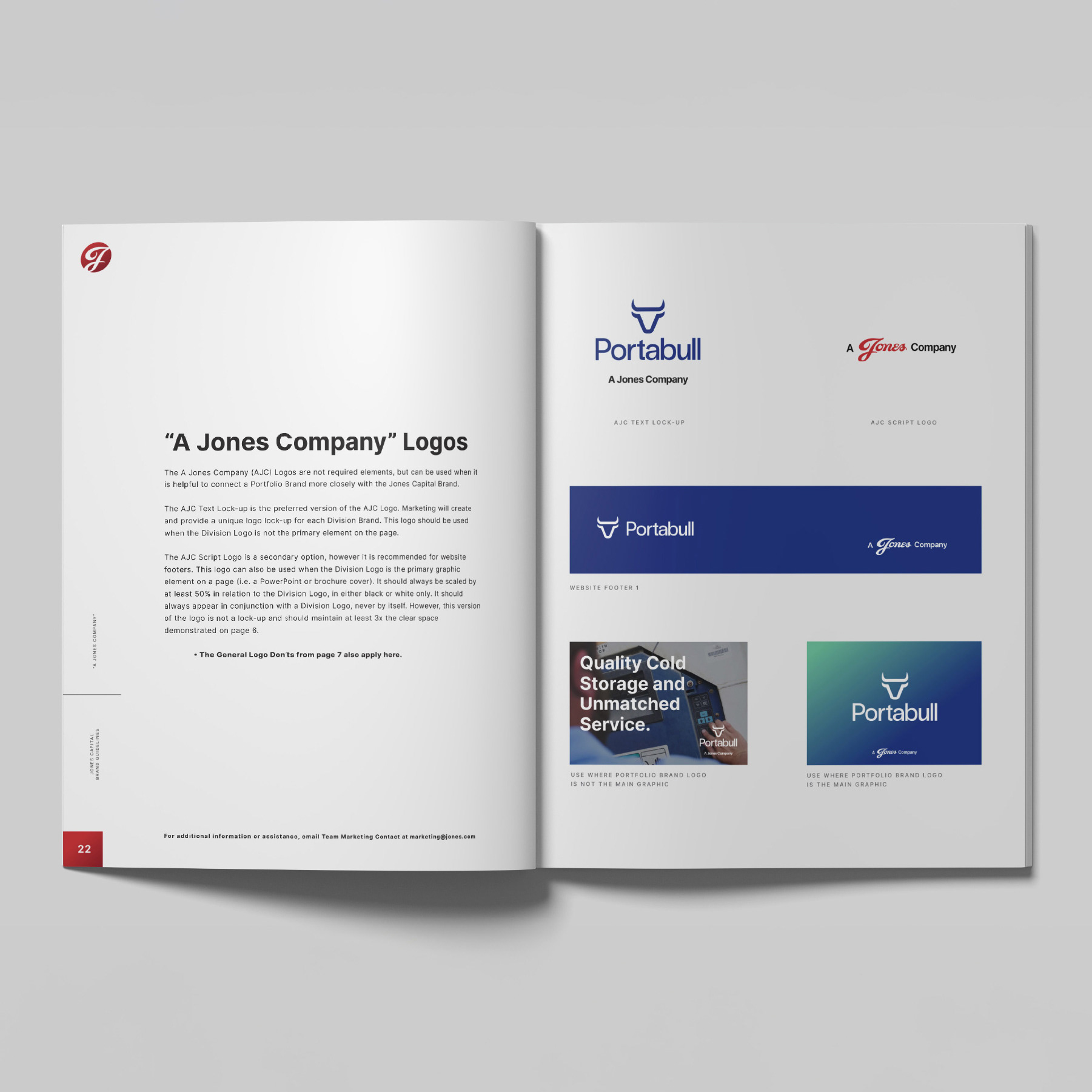
Unifying the Jones Family of Brands.
Our approach centered on developing a comprehensive set of brand guidelines that functioned as both a visual and philosophical roadmap. These guidelines established a clear hierarchy across divisions, ensuring each maintained its own distinct personality while still aligning with the strength and consistency of the Jones Capital brand. This structure extended to their portfolio companies, giving them a visual system that could scale cohesively and empower every partner to communicate with clarity and confidence.
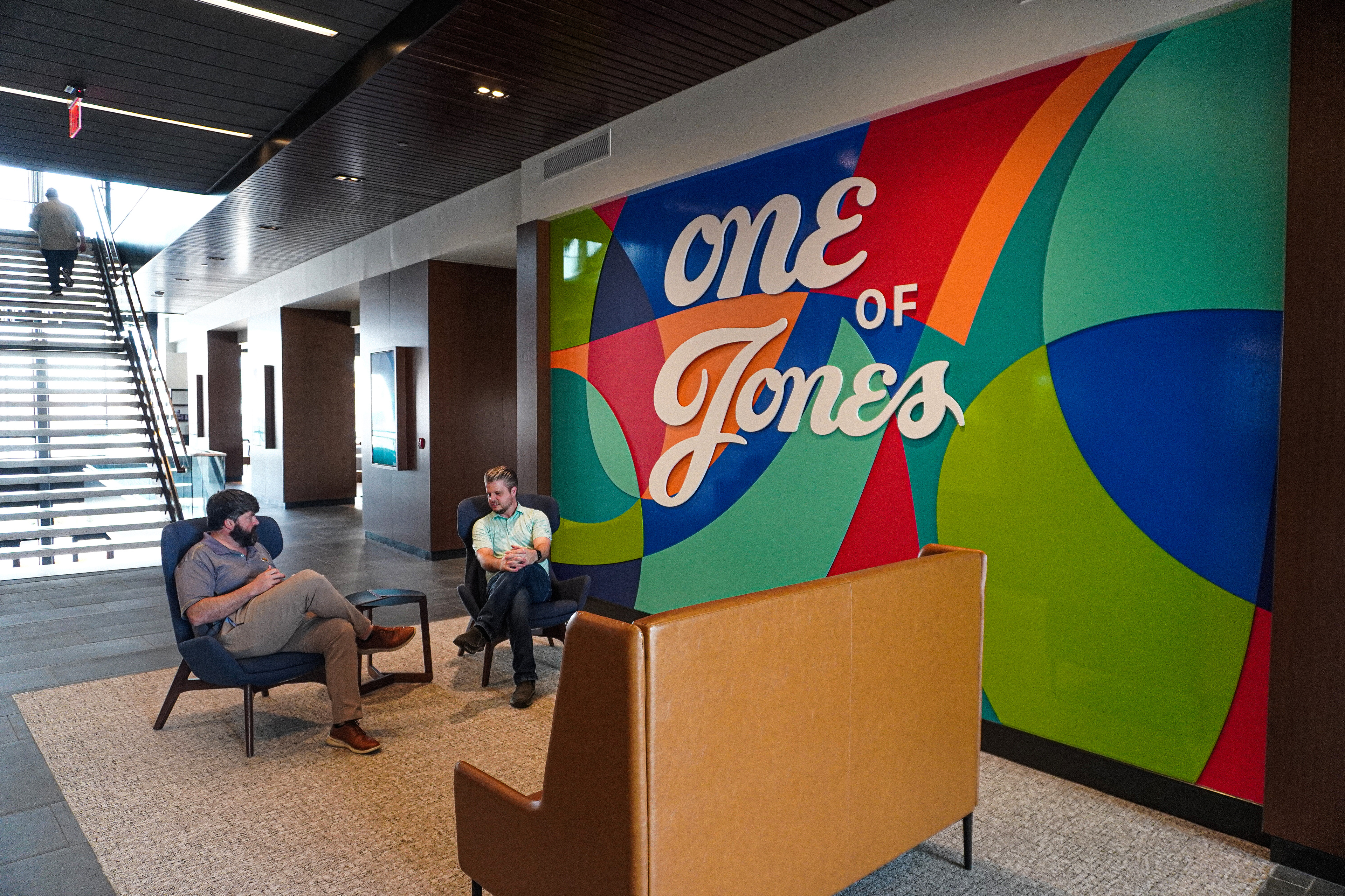
One of the defining features of this system was what we called the “Kaleidoscope of Color.” This element was designed to tie together the cultural richness of Jones Capital by integrating the colors of each portfolio company into a collective visual expression. Rather than treating the portfolio as a collection of disconnected entities, the Kaleidoscope served as a celebration of diversity within unity. It became a flexible device that could be used across communications, symbolizing the way Jones Capital thrives by bringing together unique companies under a shared vision.
The result was more than a refreshed identity. It was a long-term toolset that gave Jones Capital the ability to express who they are, unify their voice across platforms, and showcase the depth of their culture and partnerships. For me, the most rewarding part of this work was not just in crafting a polished system, but in helping Jones Capital see how their brand could embody both legacy and growth through design.
JONES CAPITAL | HIGH-BRAND IDENTITY ECOSYSTEM
JONES CAPITAL | "KALEIDOSCOPE OF COLOR" GRAPHIC ELEMENT ACTIVATION
JONES CAPITAL | COMPREHENSIVE BRAND GUIDELINES