Whiskey Business
When I began working with KYBAC alongside Saint Emblem, the challenge was to create a visual identity that felt both timeless and forward looking, something that could honor the deep heritage of bourbon while speaking to the sophistication of an alternative investment vehicle. KYBAC is not just about whiskey, it is about building a portfolio rooted in patience, craft, and appreciation over time. The brand needed to capture that balance.
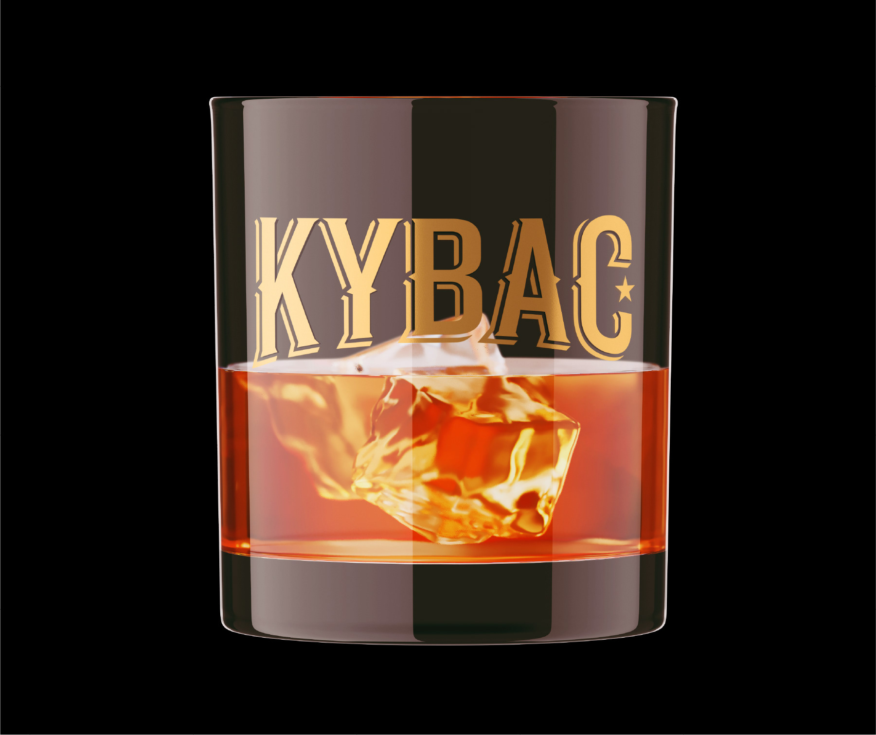
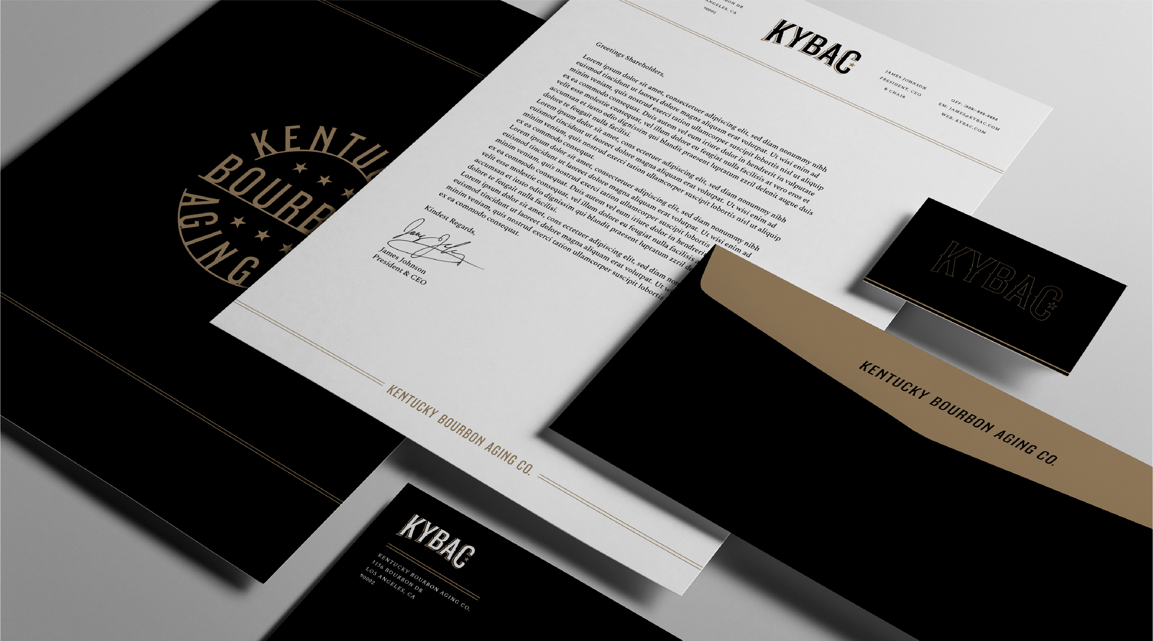
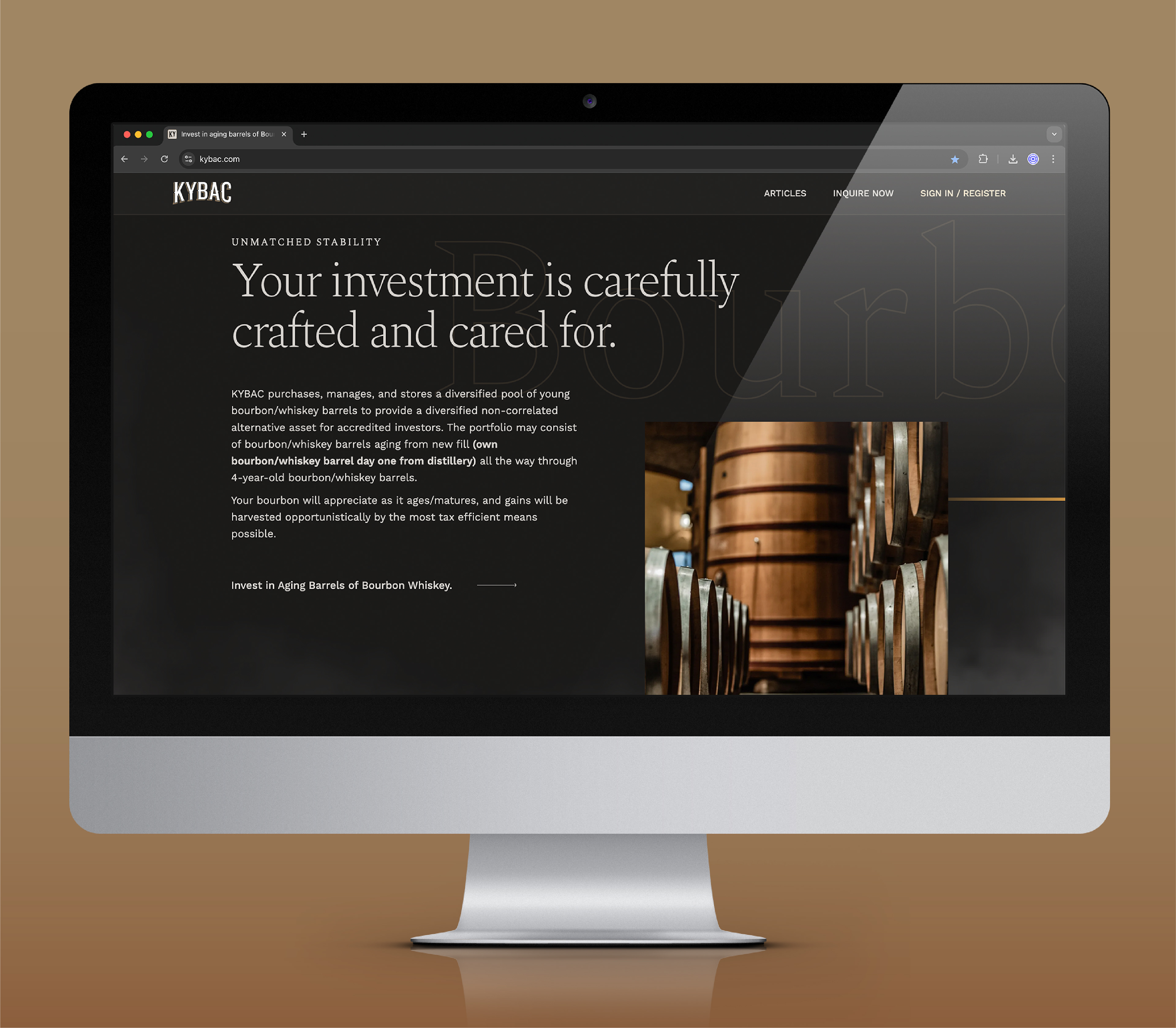
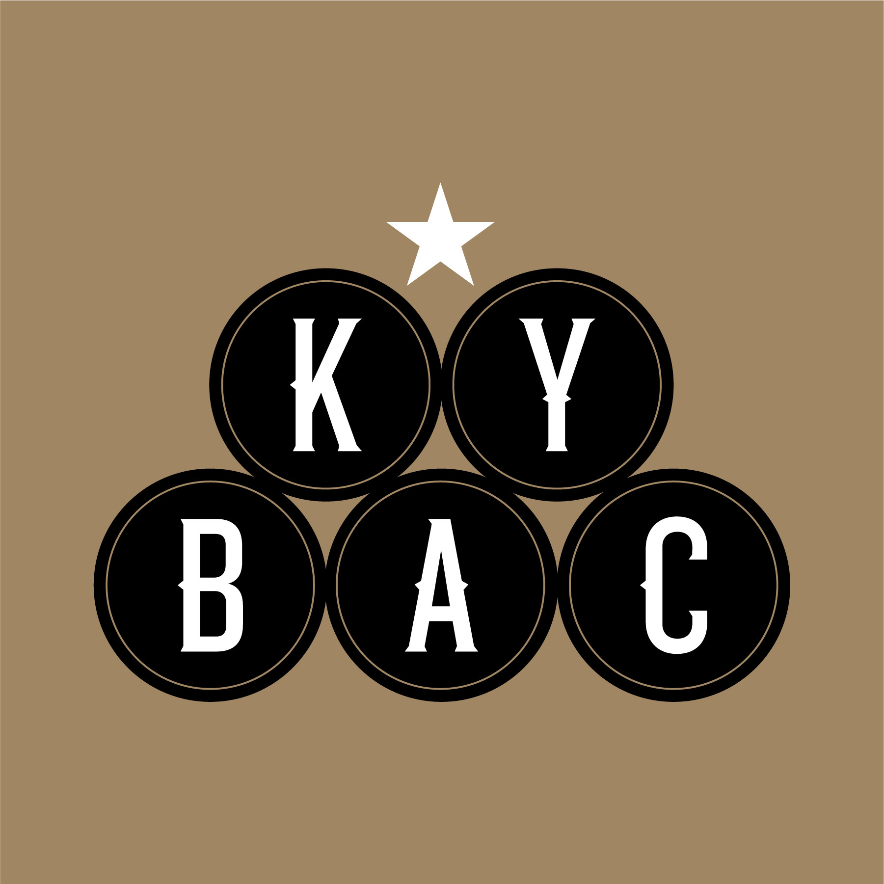
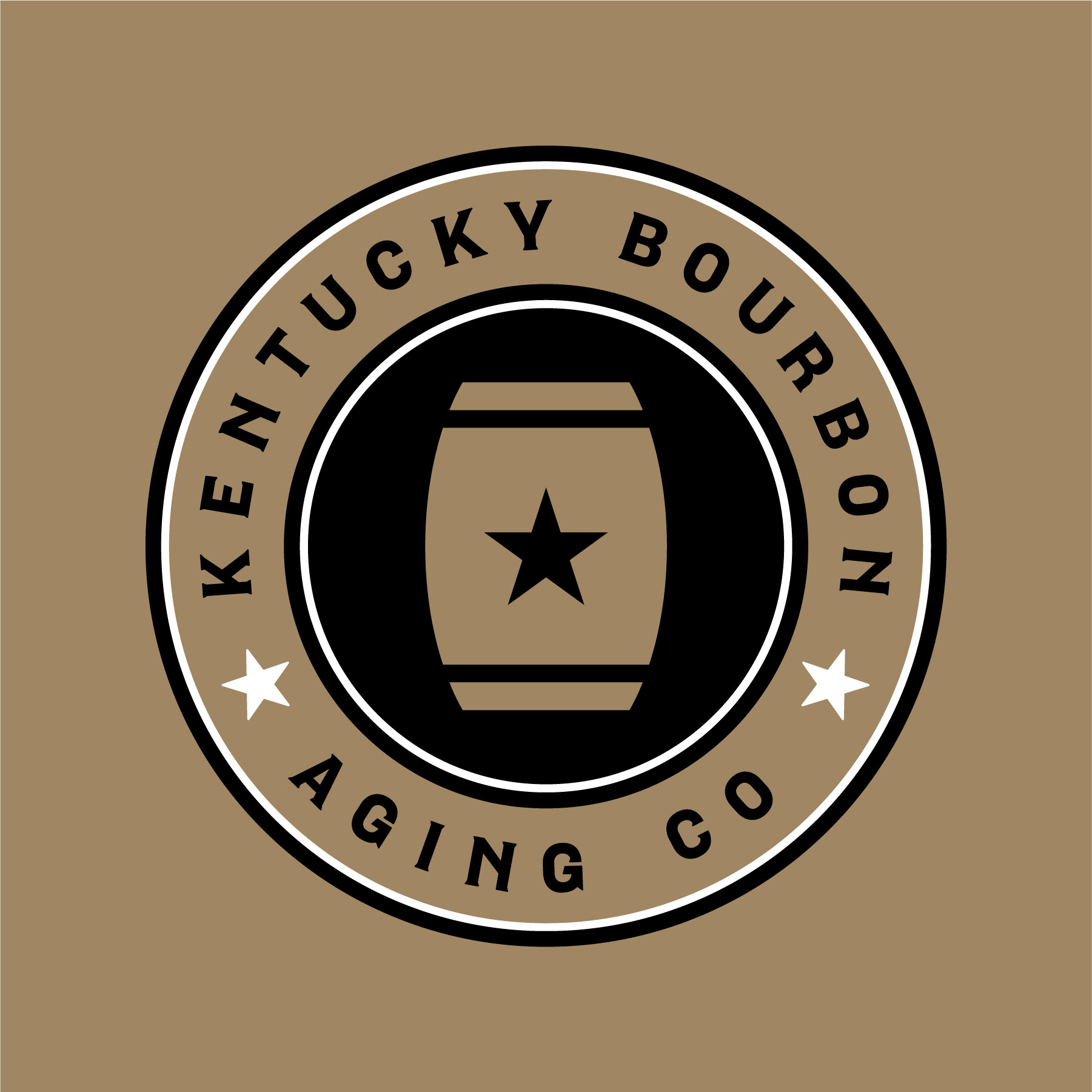
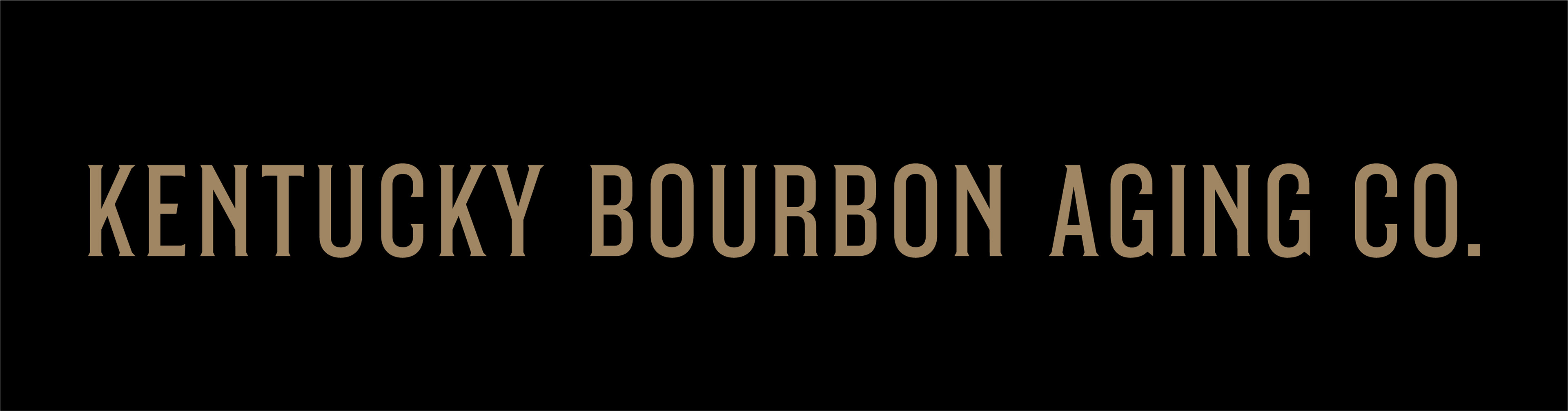
The new primary identity was designed to convey strength and trust while carrying subtle nods to the tradition of bourbon making. Paired with secondary iconography, the system allows KYBAC to show up with flexibility across investor materials, digital touchpoints, and physical applications. Every element was built to feel intentional and enduring, much like the barrels aging in their rickhouses.
The color palette combines warmth and richness with tones that evoke oak, amber, and heritage, along with refined neutrals that underscore the financial credibility of the brand. The visual styling reflects restraint and craft, ensuring that the brand feels at home in both the world of bourbon and the world of investments.
This updated identity is about more than design aesthetics. It is a system that tells KYBAC’s story with clarity and confidence, reinforcing its unique position at the intersection of tradition, craft, and innovative investment strategy.
The Saint Emblem Team:
Paul Mitchell - Principal/CD
Ethan Manning - Senior Designer
Ethan Manning - Senior Designer
Services Provided:
Identity Design
Brand Identity Toolkit
Brand Identity Toolkit
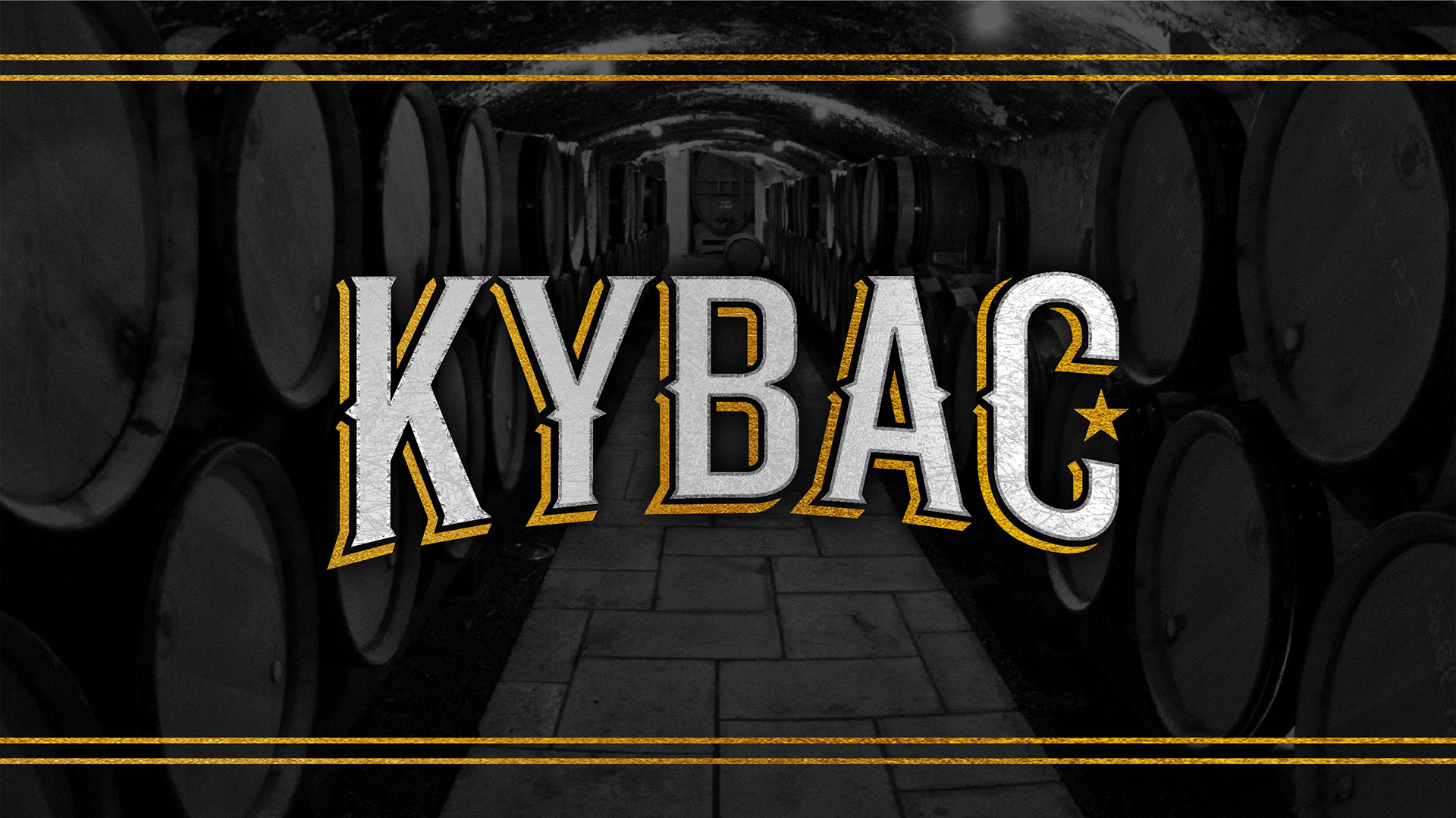
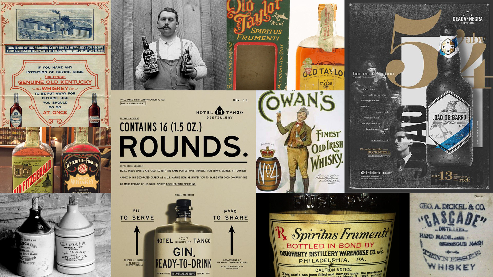
KYBAC | INITIAL INSPIRATION & RESEARCH
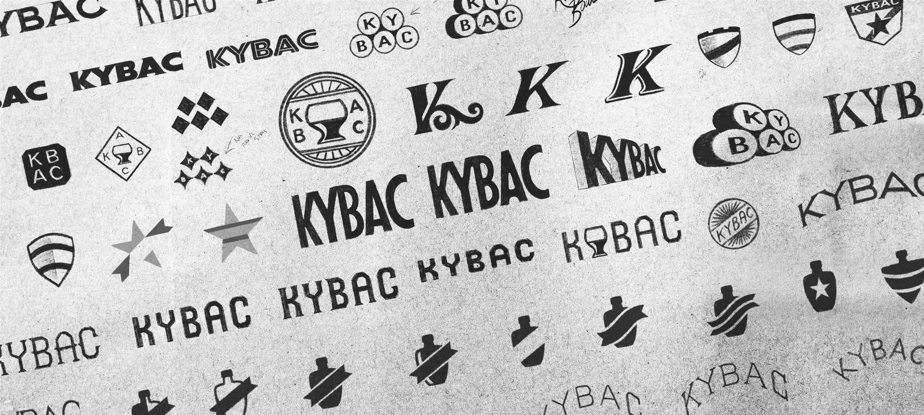
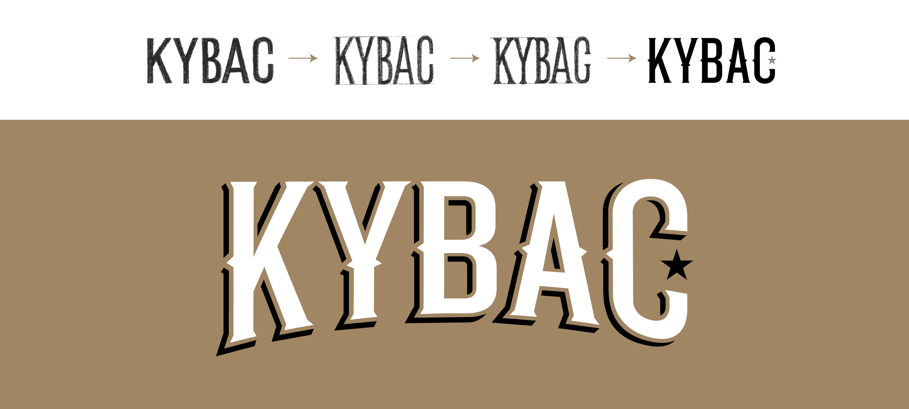
KYBAC | PROCESS SKETCHES LEADING TO FINAL IDENTITY
KYBAC | SUPPORTING IDENTITY ECOSYSTEM

KYBAC | BRAND IDENTITY ACTIVATION