Tradition Reimagined.
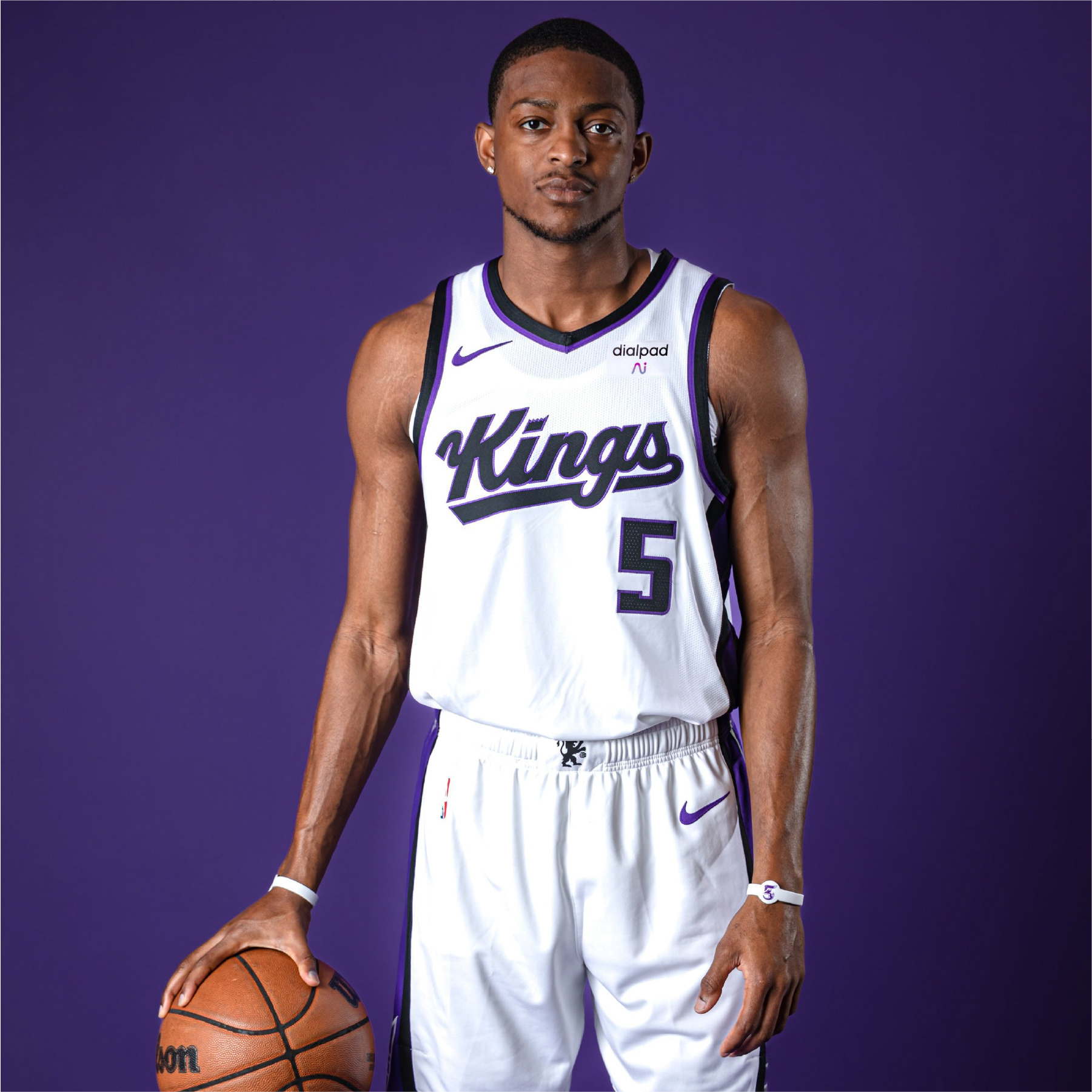
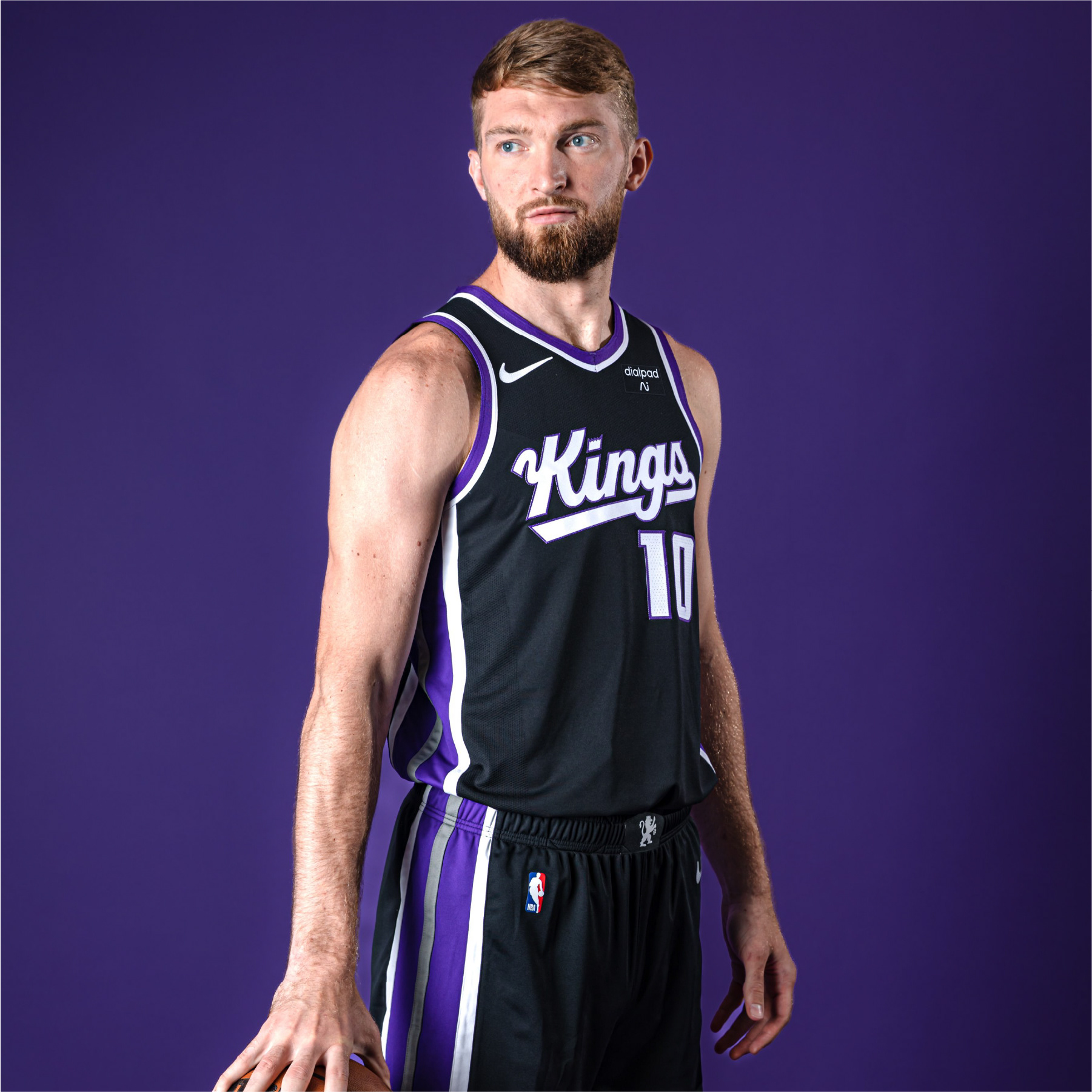
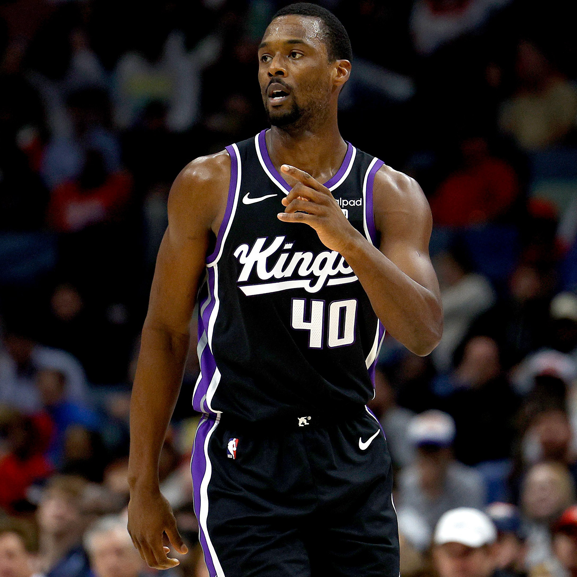
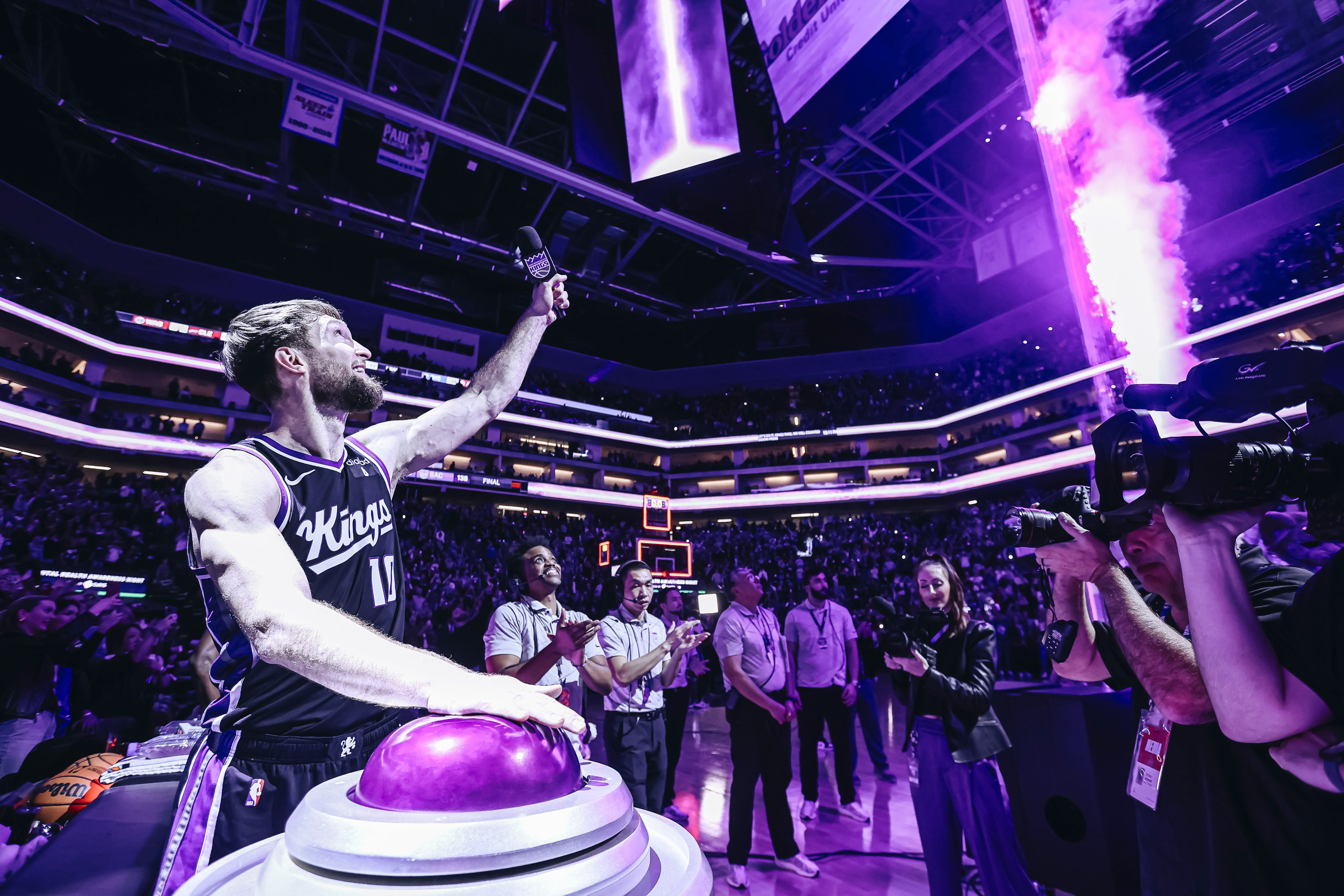
Drawing inspiration from our royal heritage and infusing the essence of the 1994 rebrand, we honor the past while crafting new traditions that embrace the evolution of our franchise. The reintroduction of a modernized script word mark, an iconic and timeless symbol intricately woven into the fabric of our franchise’s history, strengthens the bonds that bridge our proud past and thrilling future. This uniform refresh not only pays tribute to our roots but also ushers in an exciting new era of Sacramento Kings Basketball.
The RARE Design Team:
Rodney Richardson - Principal/CD
Marie Siegfried - Account Director
Ethan Manning - Designer
Cody Bass - Designer
Marie Siegfried - Account Director
Ethan Manning - Designer
Cody Bass - Designer
Services Provided:
Identity Design
Identity Design Strategy & Positioning
Custom Typography/Lettering
Identity Design Strategy & Positioning
Custom Typography/Lettering
SACRAMENTO KINGS | TEAM HERITAGE RESEARCH & INSPIRATION
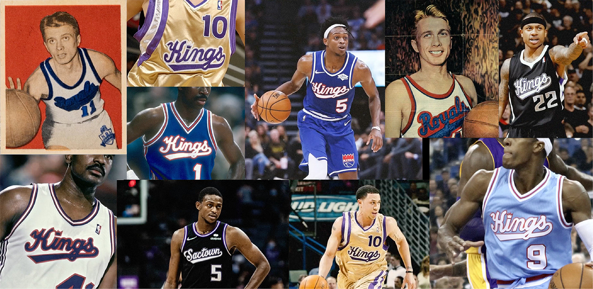
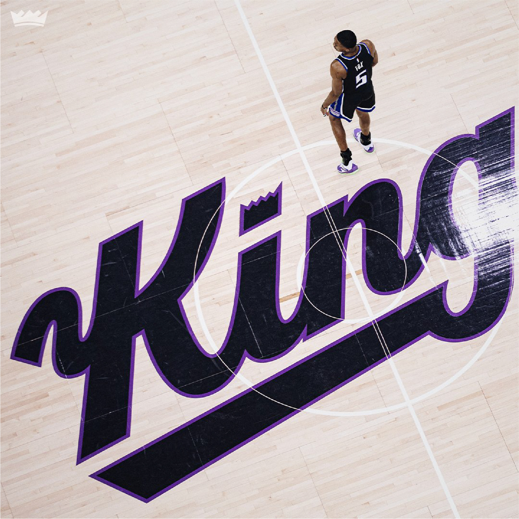
A History of Heritage.
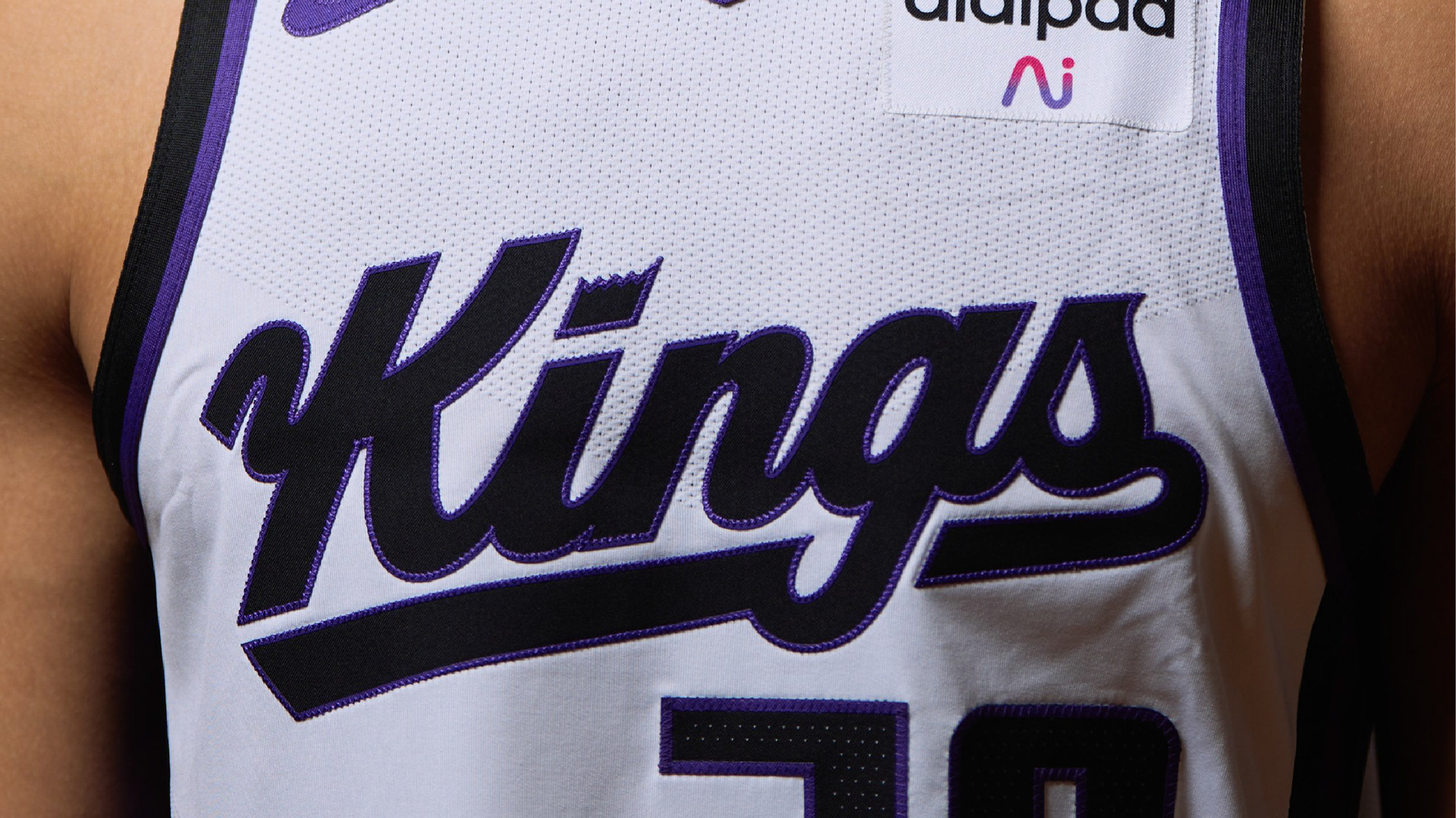
The Kings desired to bridge the gap between the past and future by revamping the iconic script mark that adorned players’ jerseys for many years. The new wordmark pays tribute to the team’s rich history while also propelling them into a new era.
By utilizing the character from past Kings script word marks with a few thoughtful touches to reflect the Kings today, our team was able to produce an iconic mark that will resonate with fans of the past, present, and future.
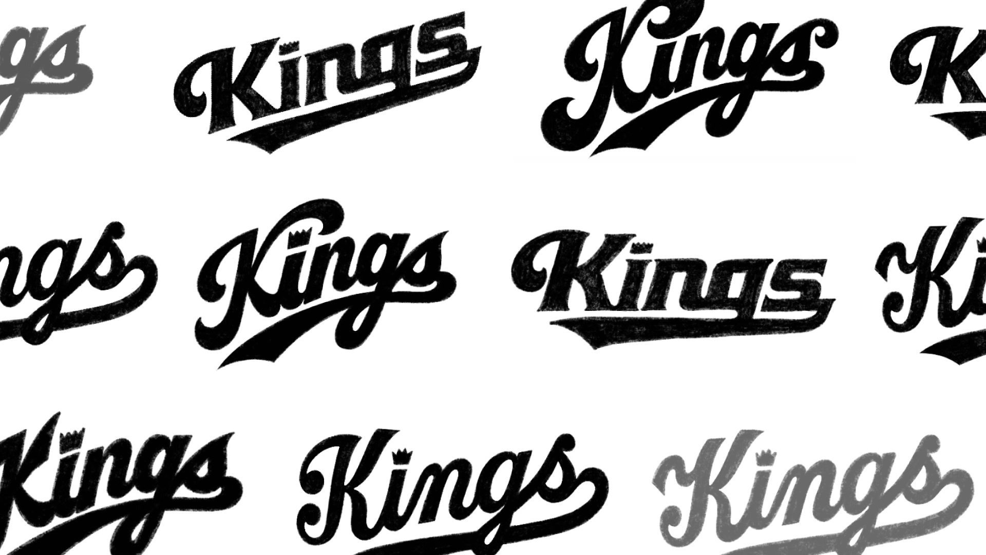
SACRAMENTO KINGS | JERSEY SCRIPT PROCESS SKETCHES
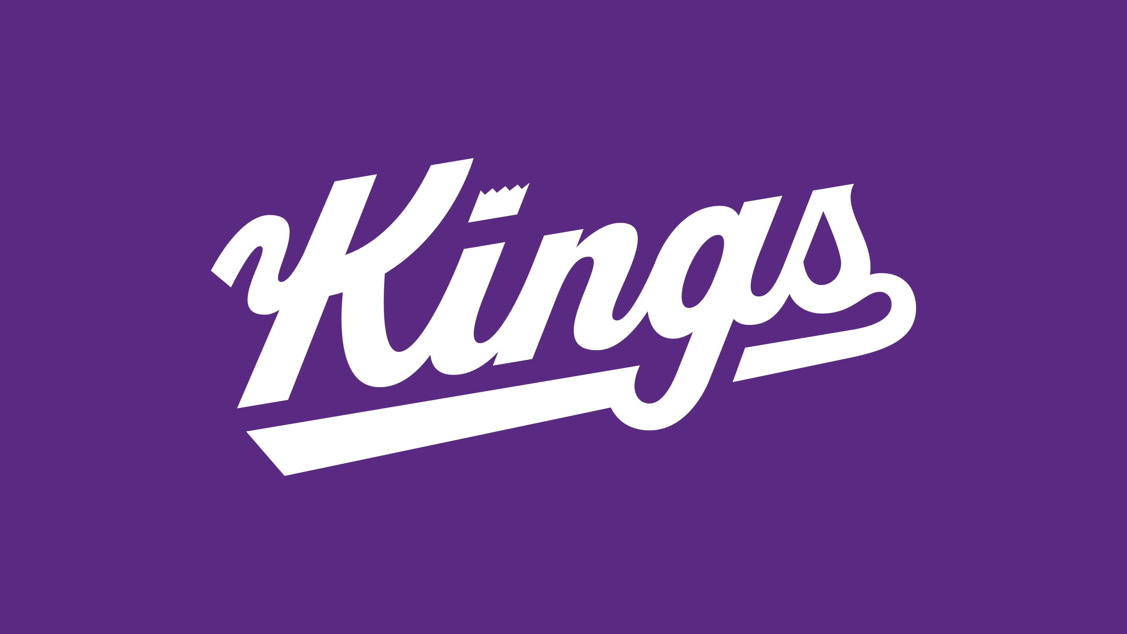
SACRAMENTO KINGS | FINAL HERITAGE JERSEY SCRIPT MARK
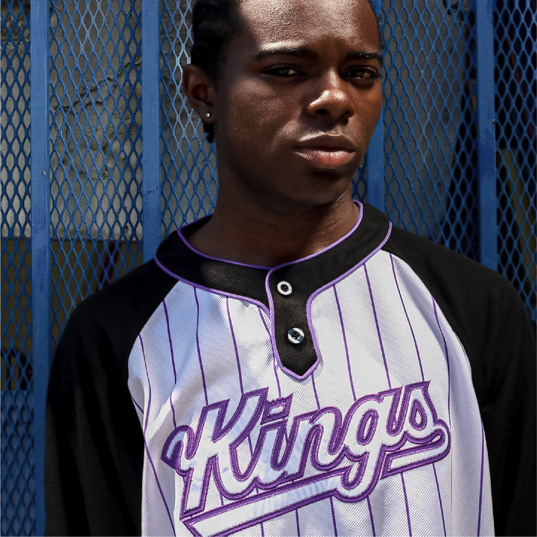
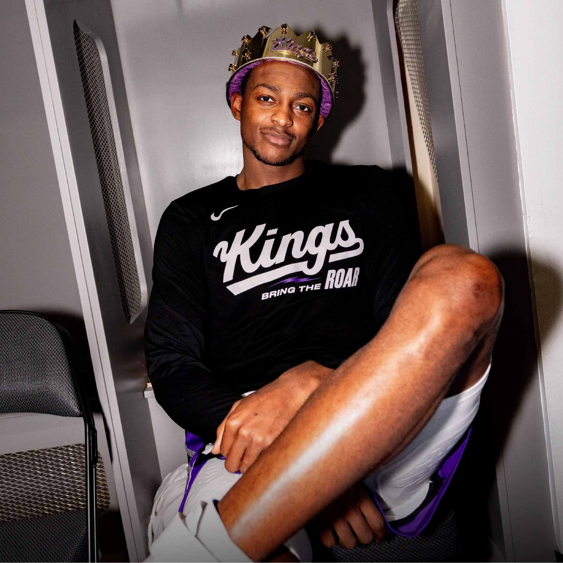
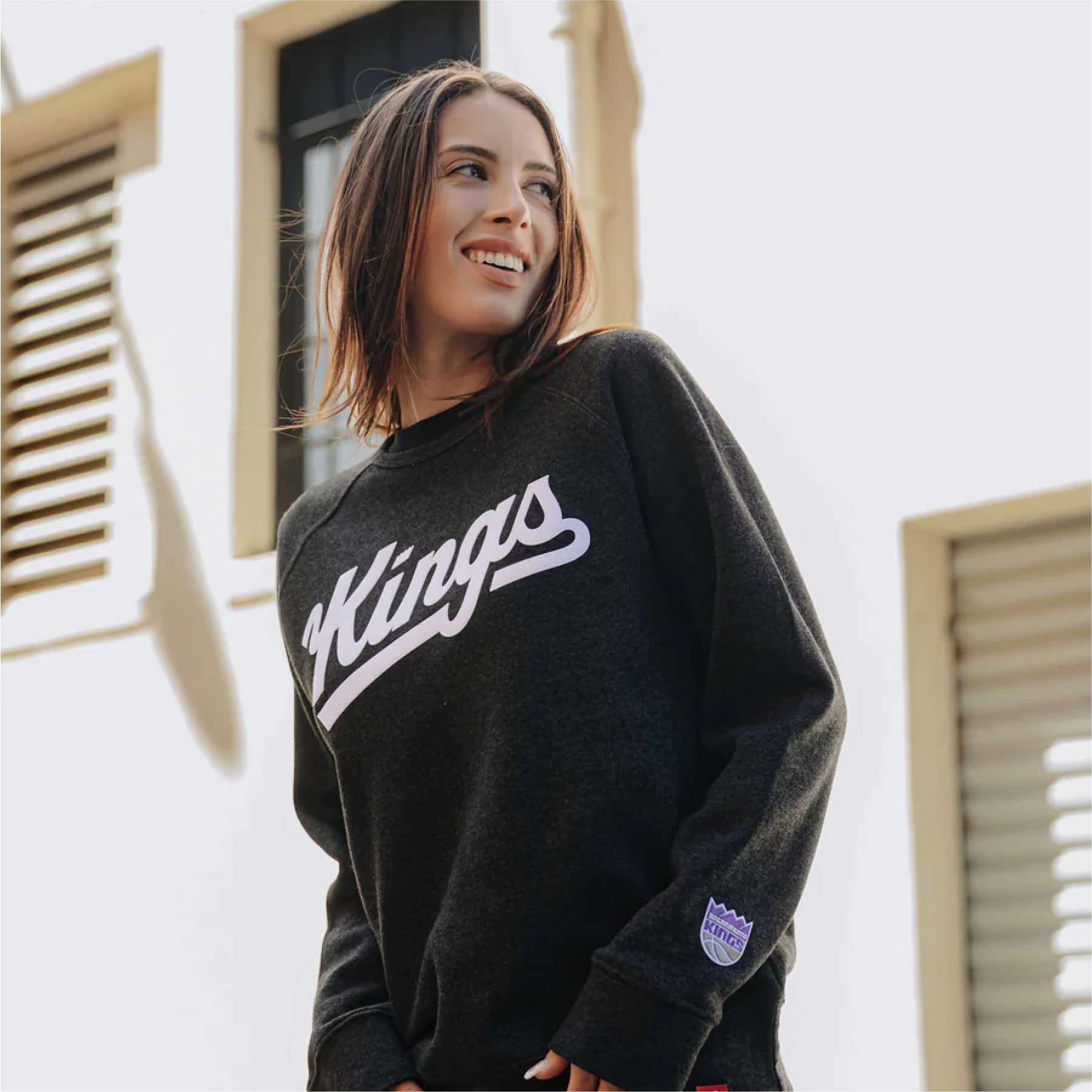
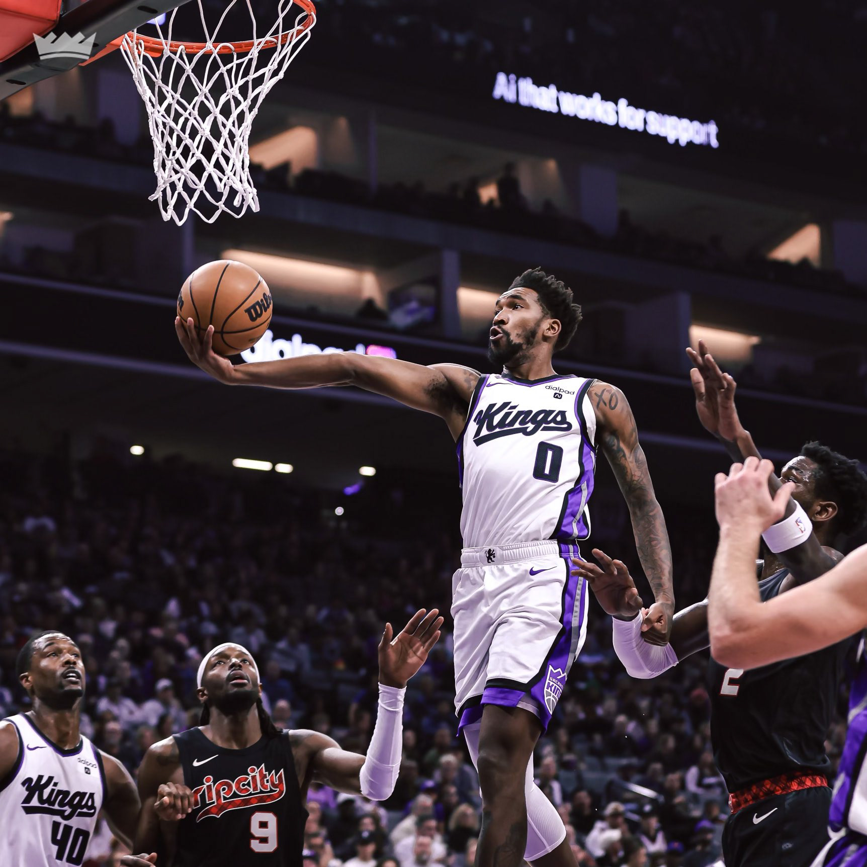
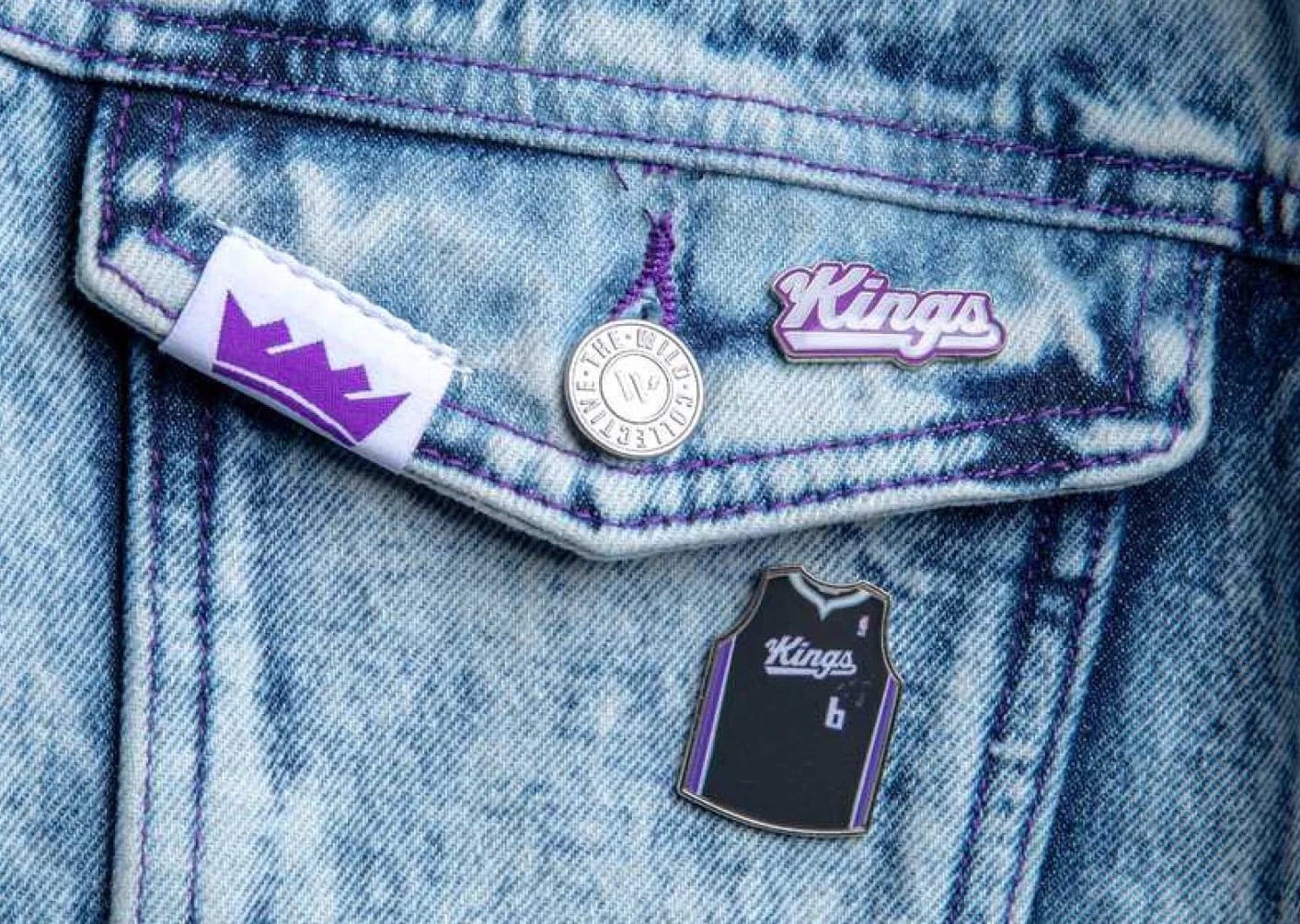
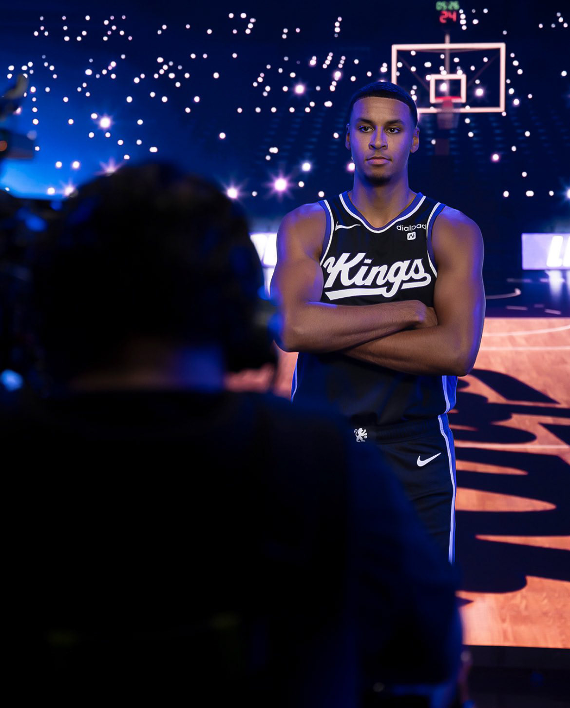
SACRAMENTO KINGS | EXAMPLES OF JERSEY APPLICATION & MERCHANDISE EXPRESSION